Fancy Framework was already a handy free CSS framework for Bricks Builder. Its big update makes it considerably easier to work with, thanks to a visual design panel that sits directly inside the editor.
You can adjust colors, typography, spacing, shapes, shadows, and layout settings while seeing the effect on your design immediately. Prefer to configure everything from the WordPress dashboard? You can do that as well. There is also an optional AI connection to help create and refine your framework.
I first covered Fancy Framework around two years ago. This update is a good reason to revisit it, particularly if you like the idea of a consistent design system without having to manage every CSS variable by hand.
Key Takeaways
- Fancy Framework’s visual panel lets you adjust shared design values directly inside Bricks Builder.
- Color controls and accessibility checks help identify contrast problems while you develop your design system.
- History and JSON export make it easier to experiment and reuse framework settings across projects.
- Dashboard access, role permissions, and optional AI integration let you tailor the framework to your workflow.
Table of Contents
- Getting Started With Fancy Framework in Bricks
- Building a Color Palette With Shades and Transparency
- Accessibility Feedback While You Design
- Typography and Spacing That Work as a System
- Shapes, Layouts, Components, and Dark Mode
- History and Panel Preferences Make Experimenting Easier
- Working From the WordPress Dashboard
- Optional AI Integration and Reusable JSON Settings
- A Much More Convenient Free Framework for Bricks
- Sponsor: WP 2FA for WordPress Login Security
Getting Started With Fancy Framework in Bricks
For my test, I downloaded and installed Fancy Framework, created a basic starter framework, and connected its values to various parts of a Bricks site.
Under Manage > Theme Styles, I set up a Fancy Framework theme style with a few colors and some very basic typography and element settings. Nothing elaborate. You need enough of the framework applied to your page to see what happens when you change it.
The demonstration design is, quite honestly, one of the ugliest things I have put together in a long time. But that is fine. It is there to make the relationship between the framework settings and the page obvious, not to win any design awards.
The important point is that your design needs to reference the framework’s variables. That is what allows a change to a shared value to flow through the elements using it.
The new visual design panel
A Fancy Framework option in the Bricks toolbar opens the new panel. Its main controls are organized into five sections: colors, typography, spacing, shapes, and More.
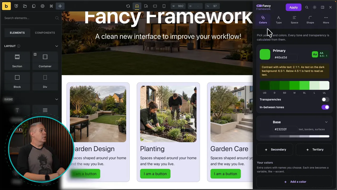
This is the biggest change. Rather than moving away from the page to configure your framework, you can make adjustments alongside the actual design.
The variables are also available in the normal Bricks Style Manager. Open its Variables area and you will find the framework’s spacing, typography, colors, and other values. The visual panel does not leave those values tucked away in a separate interface.
If CSS variables are new to you, the MDN guide to CSS custom properties is a useful reference for understanding how shared values work.
Building a Color Palette With Shades and Transparency
The Colors section starts with your primary color. Choose it using the color picker, then decide how many supporting variations you need.
With in-between tones disabled, the palette contains the primary color, two darker versions, and two lighter versions. Enable the extra tones if you want more steps between them.
I would still like an option to specify the exact number of shades, rather than simply switching the additional tones on or off. Even so, it is a straightforward way to generate a useful palette.
Choose only the transparent variations you need
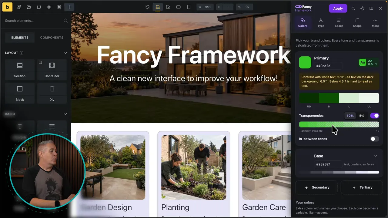
Transparency generation is optional. Enable it and choose either 5% or 10% increments.
- 5% increments: Generate finer steps, such as 95, 90, and 85 in the transparency variable names.
- 10% increments: Generate a smaller set with wider steps.
- Disabled: Leave transparent variations out of the framework.
This affects both the number of variables created and the choices available when styling your site. If you do not need transparent versions, there is no reason to include them.
Base colors, custom colors, and fixed colors
Base colors have similar controls for transparency and in-between tones. You can keep that part of the palette small or expand it to suit the project.
You can also add secondary and tertiary colors, or create specifically named colors of your own. Each gets the same configuration options, and you can delete anything you do not need.
There are fixed colors as well. I generally include a white and a black in my own custom color sets because they are useful catch-all values.
Finally, you can choose how tones are generated, using either the Even Contrast or Classic approach.
Accessibility Feedback While You Design
Fancy Framework provides contrast ratings alongside the color settings. If a combination creates a problem, the panel flags it and makes the relevant checks available under More.
That is useful feedback to have while you are still making decisions. You can identify a poor combination and address it before carrying it further through the design.
In my example, one check failed because the focus ring did not stand out sufficiently from the page. Opening the accessibility checks showed the specific issue, giving me a clear indication of what needed changing.
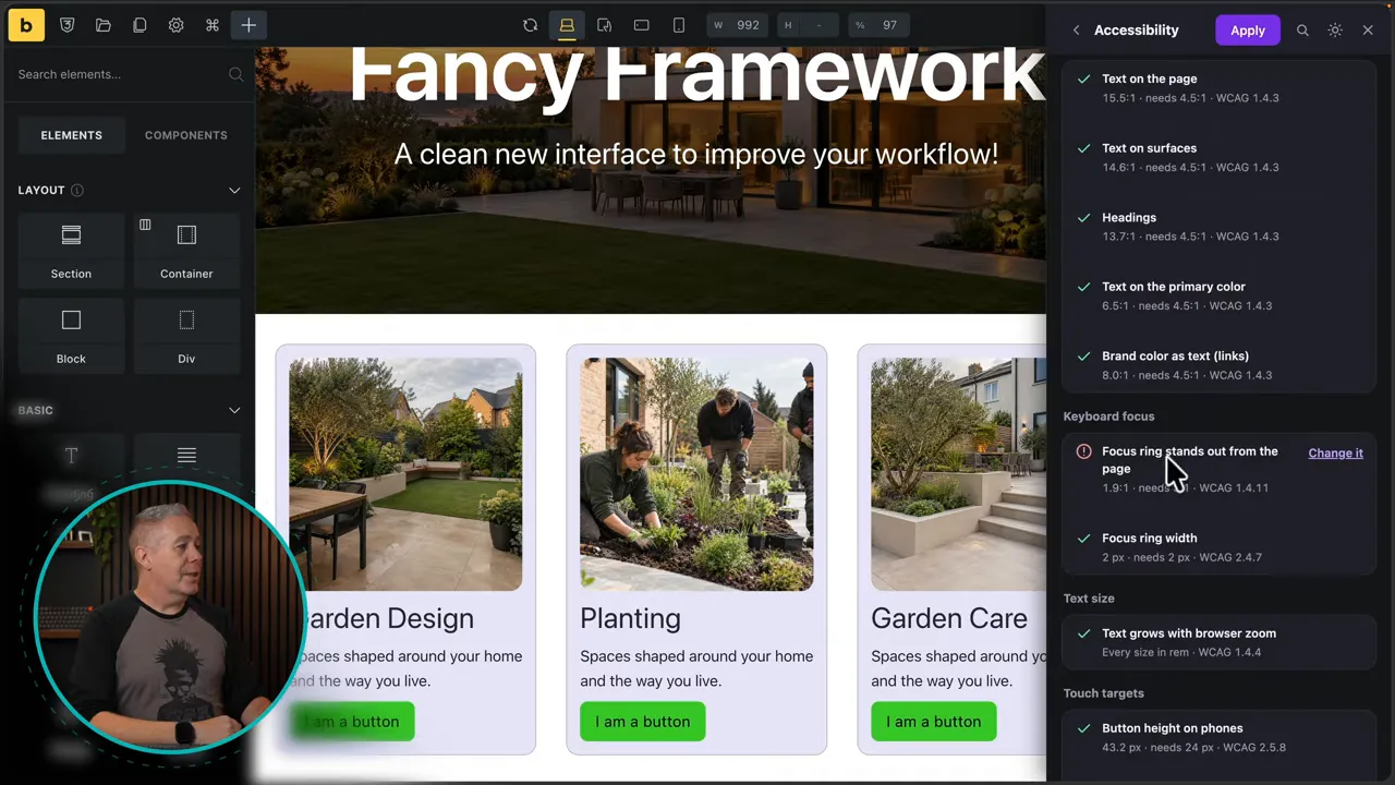
You can also copy or download the check information. The same flagged issue appears in the WordPress dashboard, so you can review it from either location.
These checks are useful design feedback, rather than a reason to stop testing the finished site. For additional context on why text contrast matters, the W3C explanation of minimum contrast is worth keeping handy.
Typography and Spacing That Work as a System
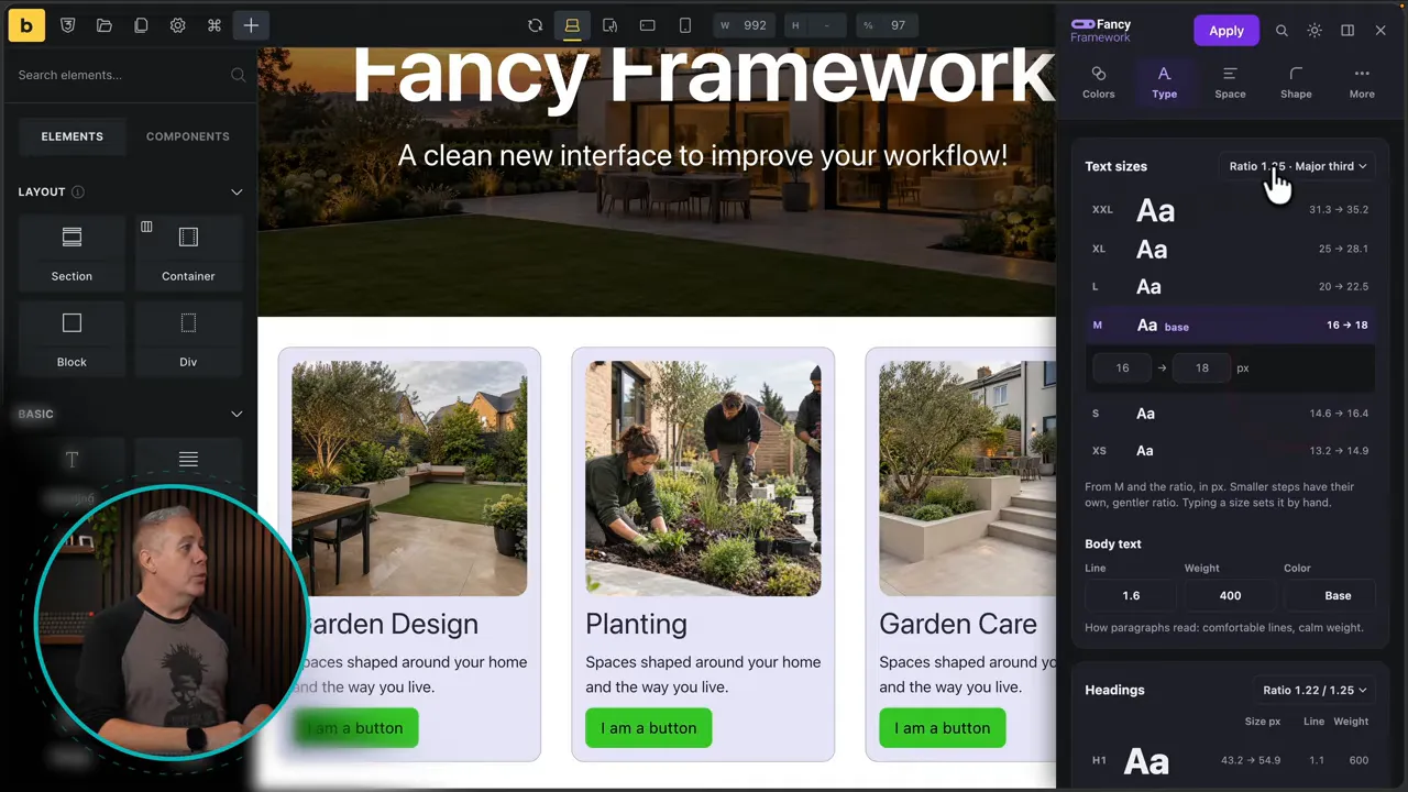
The typography controls let you adjust the values behind the type scale instead of changing each text size independently.
In my setup, the medium text size used a minimum of 16 on mobile and a maximum of 18 on desktop. Changing the desktop value to something deliberately oversized, such as 24, affected the related sizes throughout the design.
That is the benefit of connected variables. You are changing the scale, not just one isolated piece of text. After testing the effect, I returned the desktop value to 18.
You can configure different ratios for phone and desktop, along with the smaller steps in the scale. Headings have their own controls, including size values, line height, font weight, and color.
Apply the same thinking to spacing
The Space section works in much the same way. You choose ratios and configure the sizes used for phone, desktop, and section spacing.
Row spacing and content gaps reference the variables created in the spacing system. For example, if you want the shared content gap to be larger, you can assign a larger spacing value rather than editing every individual gap.
This is where a framework starts to earn its keep. Typography and spacing become a set of related decisions that you can adjust centrally, rather than a collection of unrelated numbers scattered across the site.
Shapes, Layouts, Components, and Dark Mode
The Shapes section includes visual previews for corner radius and shadows. You can adjust the underlying values and see the kinds of shapes those settings produce.
Under More, there are additional controls for the structure and styling of your site:
- Layouts and grids: Configure container width, side padding, header height, grid behavior, and grid content widths.
- Buttons and cards: Adjust settings such as padding and radius.
- Base CSS: Review and configure the available base styling options.
- Screen ranges: Configure the framework’s screen range settings.
You can keep the framework fairly simple or go further into the available options. There is no need to configure everything just because it is there.
Use a personality preset as a starting point
The Personality section provides preset starting points for the framework. That is a nice addition if you are new to creating design systems and would rather begin with a coordinated set of choices than a blank slate.
You can use one as your foundation and then refine the individual values to suit the project.
Connect dark mode to the Bricks toggle
Fancy Framework also includes dark mode settings. In Bricks, search for the Dark Mode Toggle element and add it to your layout, then configure how you want dark mode to work through the framework’s options.
Dark mode is optional. If it is not part of the project, you do not have to use it.
History and Panel Preferences Make Experimenting Easier
The History section lets you review previous changes and load an earlier version. You can try a different direction and, if it does not work, return to where you started. Pretty nifty.
The panel itself has a few useful quality-of-life options:
- Move it between the right and left sides of the editor.
- Choose a light appearance, a dark appearance, or Auto to follow your operating system.
- Search for a particular setting.
- Close the panel when you have finished.
There are also Fonts and Cleanup entries marked as coming soon in the version I tested. Those are not features to rely on yet, but they indicate more work is planned.
Working From the WordPress Dashboard
If you prefer a setup-and-forget approach, open Fancy Framework from the WordPress dashboard and choose Open the design panel. The same panel is available there, and changes saved through it take effect across the website wherever those framework values are used.
Personally, I prefer having it inside Bricks. When I am tweaking a design, I like to see the changes in context. But you can work either way.
The dashboard provides an overview of the framework, including its variable count and information about manual changes, along with an option to undo changes. It also surfaces accessibility issues and links back to the full checks in the panel.
A visual preview shows how your setup looks, with breakpoint controls so you can inspect it at different sizes.
Control access and where the panel appears
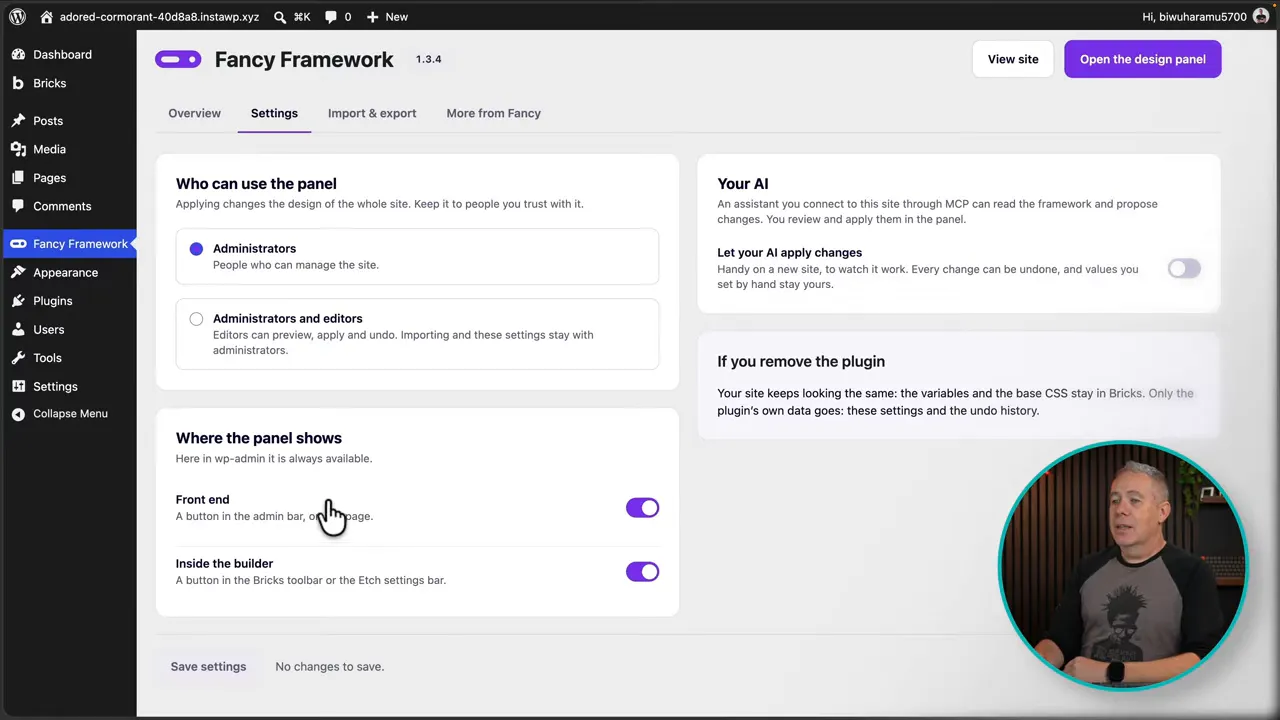
In Settings, you can restrict panel access to administrators or allow editors to use it as well.
You can also choose where the panel is available, including the builder and front end. If you only want it inside the editor, configure it that way. You are not forced to have it available everywhere.
Optional AI Integration and Reusable JSON Settings
Fancy Framework includes an optional AI setting. Once enabled and connected to an appropriate AI tool, the integration is intended to help manage the framework, make changes, and identify or correct accessibility issues.
At the time of my test, connecting it required an additional WordPress AI/MCP connector plugin. That setup may change as WordPress AI integration develops, so treat the connection requirements as version-dependent rather than a permanent installation process.
The key point is that AI is optional. You can use the visual controls to build and maintain the framework without connecting an AI tool.
Export your baseline for future projects
The import and export options let you save your framework settings as a JSON file. You can download it, upload it, or share it.
This is particularly useful if you develop a baseline setup that you want to reuse across multiple sites:
- Configure your preferred colors, typography, spacing, and other framework settings.
- Export the settings to a JSON file.
- Import that file into a future site as your starting point.
- Adjust the imported setup for the new project.
That saves you from rebuilding the same foundation every time.
A Much More Convenient Free Framework for Bricks
The standout improvement is not simply the number of available settings. It is being able to change the framework directly beside the design and immediately see what those decisions do.
Add the accessibility feedback, history, dashboard access, and reusable JSON settings, and Fancy Framework becomes a much more convenient way to build a consistent foundation for a Bricks website.
The More From Fancy area also lists other plugins and tools from the developer, John. I have no connection with him; I came back to this tool because the update looked genuinely useful. Free tools take work to maintain, and supporting the developer through another product or a contribution is always worth considering if the framework becomes part of your workflow.
Sponsor: WP 2FA for WordPress Login Security
WP 2FA by MalCare sponsored this feature. Two-factor authentication adds a second verification step to WordPress logins, so a stolen password alone is not enough to sign in.
WP 2FA supports enforcement by user role, grace periods, and trusted devices. Verification options include authenticator apps, email codes, SMS, push notifications, and YubiKey. It is a practical security improvement that does not need to make everyday logins unnecessarily awkward.


