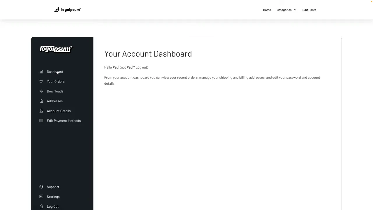
The default WooCommerce My Account page does the job, but it does not have to be the experience you give your customers. With a custom layout, branded navigation, and a few well-placed extras, you can turn it into something much more professional.
The approach is straightforward: build your own dashboard layout, let WooCommerce handle the account functionality, and connect your navigation to the relevant account endpoints. You can also add a support page that feels like part of the same dashboard, complete with FAQs and a contact form.
I’m using Bricks Builder for the layout, but you do not have to. Elementor, Gutenberg, or another suitable builder can do the same basic job. Once the overall design is in place, the WooCommerce side of the process follows the same principles.
What You'll Learn
- Build a branded sidebar and display logged-in customer details using dynamic data.
- Keep WooCommerce account functionality while replacing its default navigation with your own links.
- Connect account endpoints and assign the custom page in WooCommerce settings.
- Create a matching support page without adding a custom WooCommerce endpoint.
Table of Contents
- What the Custom Dashboard Will Include
- 1. Build the Two-Column Dashboard Layout
- 2. Create the Main Account Navigation
- 3. Separate the Main Navigation from the Support Links
- 4. Add the Logged-In Customer’s Profile
- 5. Insert the WooCommerce My Account Content
- 6. Hide the Duplicate WooCommerce Navigation
- 7. Connect the Navigation to WooCommerce Endpoints
- 8. Tell WooCommerce Which Account Page to Use
- 9. Build a Matching Support Page
- A Better Account Experience Without Rebuilding WooCommerce
What the Custom Dashboard Will Include
We are not rebuilding order management or customer account forms from scratch. WooCommerce already provides those. What we are creating is a nicer home for them.
The dashboard will bring together:
- Branded navigation: A sidebar with your logo, icons, colors, and account links.
- Customer information: The logged-in user’s avatar, name, and email address.
- Order history: Access to orders and individual order details.
- Downloads: Downloadable products available to the customer.
- Address management: Billing and shipping address editing.
- Account details: The customer’s personal account settings.
- Support: FAQs and a request form inside a matching page layout.
- Logout: A link into WooCommerce’s logout flow.
Once you understand the structure, much of the work is simply repeating the same process with different labels, icons, and links.
1. Build the Two-Column Dashboard Layout
Start by creating a new page for your custom account design. We will tell WooCommerce to use that page later.
In Bricks, add the following structure:
- A section containing an account container.
- A left navigation block inside the container.
- A main content block alongside the navigation block.
Select the account container and set its direction to horizontal, so the two blocks sit side by side.
For this example, set the left block’s minimum width to 30% and the right block’s minimum width to 70%. These values establish the basic split. You can adjust the proportions to suit your own design.
Give the sidebar enough height
To create the full-height appearance, set a minimum height of 100vh on:
- The outer section.
- The account container.
- The left navigation block.
Then give the navigation block a dark background color. That immediately creates a clear separation between the navigation and the account content.
I’m using vh here to keep the setup simple. Other viewport units, including dvh and svh, are available, but they handle viewport sizing differently. The MDN guide to viewport units is useful if you want to explore those differences.
Name the elements as you go
A little housekeeping now makes the rest of the build much easier. Rename the elements to something meaningful, such as:
- Account Container
- Left Nav Block
- Main Content Block
I like including the element type in the name because it tells me what I am selecting at a glance. If you prefer a shorter naming convention, that is absolutely fine. The important thing is that the structure makes sense to you.
I’m also using Core Framework for spacing and typography variables. It speeds up the design process, but it is not a requirement. Wherever I use a medium or large spacing variable, you can use your own preferred values.
2. Create the Main Account Navigation
Add an Icon List element inside the left navigation block. Remove the extra default entries so you can configure one item properly before duplicating it.
- Choose an appropriate icon for the dashboard.
- Change the label to Dashboard.
- Clear any unwanted item background color.
- Set the text and icon color to white.
- Set the list to stack vertically.
- Align the items to the left.
Once the first item looks right, duplicate it and change the labels and icons for the other account sections. The main group can include Dashboard, Orders, Downloads, Addresses, Account Details, and Payment Methods where appropriate for your store.
Leave the links for the moment. We will connect those once the account panel is working.
Add padding and hover styles
Select the left navigation block and add padding on all four sides. I use a medium spacing variable here, which gives the navigation some breathing room without making the sidebar feel empty.
Next, select the icon list and switch to its hover pseudo-class. Set the hover color to your brand color. I’m using teal against the dark background.
Apply the styling consistently across the items, leave the hover editing state, then save and preview the page. You should now have a simple vertical navigation with a clear color change on hover.
3. Separate the Main Navigation from the Support Links
The secondary links belong at the bottom of the sidebar rather than immediately below the main account links.
Duplicate the first icon list, remove the entries you do not need, and change the remaining items to your secondary options, such as Support and Log Out.
To separate the two groups properly:
- Wrap the main icon list in its own block.
- Wrap the secondary icon list in another block.
- Select the parent left navigation block.
- Set its main-axis alignment to space-between.
With the sidebar arranged vertically, the first wrapper sits at the top and the second sits at the bottom.
The wrappers are the useful bit. Anything you add inside the top wrapper stays with the main navigation. Anything inside the bottom wrapper stays with the support links.
Add the logo
Insert a Logo element into the top wrapper, above the main icon list. Select the logo image and add some bottom spacing so it does not sit too close to the first navigation item.
There is no need to complicate this. The logo and main links now behave as one group, while the secondary links remain separate below.
4. Add the Logged-In Customer’s Profile
Inside the bottom wrapper, add a new block for the customer profile. Within it, create two divs: one for the avatar and one for the customer’s details.
Display the dynamic avatar
Add an Image element to the first div. Open the dynamic data selector and choose User Profile → User Picture.
For this example, set the avatar to 75 pixels wide and 75 pixels high. Apply a border radius of 100% to the avatar’s clipping element, then set its overflow to hidden so the picture is contained in a circle.
You can also adjust the image’s aspect ratio and object-fit settings as needed for your design.
Display the customer’s name and email
In the second div, add a Rich Text element. Clear the placeholder content and insert these dynamic user profile fields:
- First name.
- A space.
- Last name.
Duplicate the text element, remove its contents, and insert the User Email dynamic field instead.
Set the typography color to work against the sidebar background. Then select the profile block, change its direction to horizontal, and add a column gap between the avatar and text.
Finally, rename the relevant elements to something obvious, such as Profile Block, Support Block, and Main Nav Block. You now have a personalized sidebar rather than a static collection of links.
5. Insert the WooCommerce My Account Content
The main content area needs to display the account section requested by the customer. There are two ways to add this in the setup we are building.
Option A: Use the WooCommerce shortcode
Add a Shortcode element or block inside your main content block, then enter:
[woocommerce_my_account]This is the useful option when working with Gutenberg or another builder that supports shortcodes. It brings in WooCommerce’s My Account output, including the dashboard welcome content.
Option B: Use the Bricks Account Page element
In Bricks, search the elements panel for Account and insert the Account Page element instead.
In this example, it provides the same account output without needing to enter the shortcode manually. Choose one method, not both.
The companion tutorial and updated code snippets provide an additional reference for this build.
6. Hide the Duplicate WooCommerce Navigation
At this point, you may find that your custom sidebar appears alongside another set of Dashboard, Orders, Downloads, and account links inside the main content area.
That second menu comes from the WooCommerce My Account template. We already have our own navigation, so we do not need to display it again.
For this approach, open the WordPress Customizer, go to Additional CSS, and add:
.woocommerce-MyAccount-navigation {
    display: none;
}
Publish the change, then refresh the builder or page preview if the old navigation is still visible.
This hides the default navigation; it does not remove its markup. The element remains in the page source, so treat this as a presentation adjustment rather than a template-level removal. It is the workaround used here to avoid editing the physical WooCommerce template files.
Finish the main panel’s spacing
Select the main content block and add padding on all four sides. I use a large spacing variable to give the account content a little more room.
You can also insert a heading above the account element, such as My Account Dashboard. In this design, it is the page’s only main heading, so I set it to H1 and control its visual size separately through typography settings.
Add some bottom spacing beneath the heading, save, and refresh if Bricks does not immediately reflect the typography changes.
At this stage, you are changing the surrounding layout and presentation. Changing the underlying content generated by WooCommerce is a separate template customization task.
7. Connect the Navigation to WooCommerce Endpoints
WooCommerce uses endpoints to display different account sections. The name sounds more complicated than the idea.
An endpoint is simply added to the account page’s base URL. For example, if your account page is at /my-account/, the orders section is at /my-account/orders/.
Configure the Orders link first
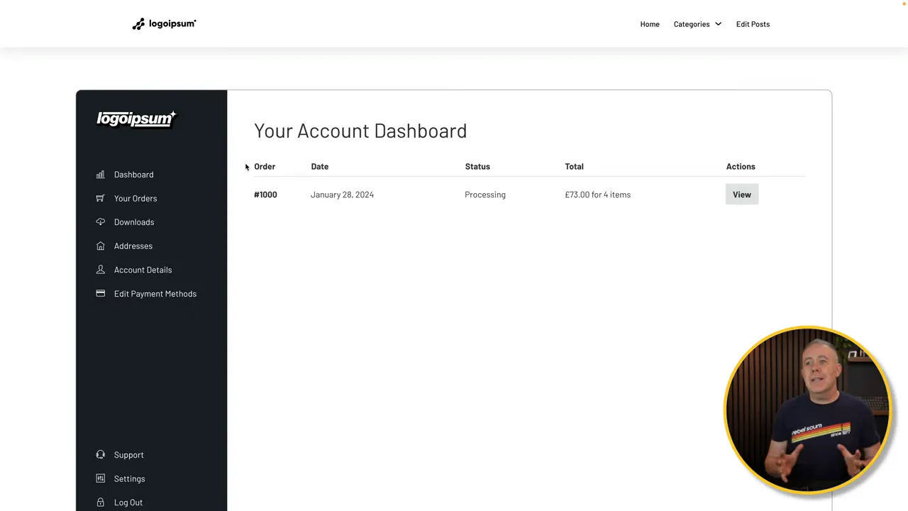
Open the Orders item in your main icon list. In Bricks, choose External URL as the link type so you can enter the path directly, then use /my-account/orders/.
Although the builder calls this an external URL field, the root-relative path still points to your own site. Leaving out the domain makes the link less tied to one particular domain name.
Save the page and test the Orders link. It should open the customer’s order history.
Set the remaining account links
Repeat the same process for the other navigation items. With the default account page path and endpoint names, use:
- Dashboard:
/my-account/ - Orders:
/my-account/orders/ - Downloads:
/my-account/downloads/ - Addresses:
/my-account/edit-address/ - Account Details:
/my-account/edit-account/ - Payment Methods:
/my-account/payment-methods/ - Log Out:
/my-account/customer-logout/
These paths need to match your store’s configuration. The WooCommerce account endpoints documentation is the reference for the available endpoints.
You do not need to manually create an individual order link in the sidebar. WooCommerce generates the relevant View link within the orders list and handles the order-specific destination.
The plain logout endpoint used here leads into a confirmation step. Do not assume that selecting the sidebar link will immediately end the session without confirmation.
8. Tell WooCommerce Which Account Page to Use
The custom design is in place, but WooCommerce still needs to know which page is the account page.
I prefer to keep the familiar my-account slug for this setup. You can use a different slug, but all the navigation paths must then match it.
- Open Pages in the WordPress dashboard.
- Find the original WooCommerce My Account page and use Quick Edit to change its slug, freeing up
my-account. - Open Quick Edit for the new custom account page.
- Set its slug to
my-accountand update it. - Go to WooCommerce → Settings → Advanced.
- Set the My account page field to your new custom page and save the settings.
The important part is that the page assignment and the paths used in your navigation agree.
Test the account functions
Work through the dashboard links and confirm that:
- Orders opens the order history.
- The View action opens an individual order.
- Downloads displays the customer’s available downloads or an appropriate empty-state notice.
- Addresses displays billing and shipping addresses and allows editing.
- Account Details opens the account form.
- Log Out opens the expected confirmation flow.
A notice that the customer has no downloads is not, by itself, a broken dashboard. It can simply mean that account has no downloadable products available.
9. Build a Matching Support Page
Support is slightly different because it is not one of the standard account endpoints used above.
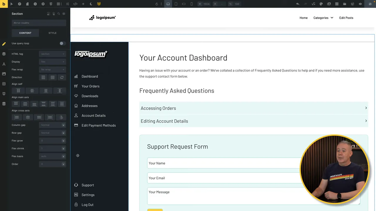
You could add a custom endpoint, but that introduces extra work. For this build, the simpler option is to create an ordinary page using the same dashboard layout.
- Create a new Support page.
- Copy the dashboard layout into it, including the sidebar and main content area.
- Remove the WooCommerce account element from the main content area.
- Add an accordion for frequently asked questions.
- Add a contact form underneath for support requests.
This gives customers somewhere to find quick answers and a way to contact you without losing the visual context of the account area.
Connect Support in both layouts
Open the Support item in the sidebar icon list. This time, choose Internal Post or Page and select the Support page you just created.
Make the same change in the sidebar on the main account page. Because the support layout was copied, the two copies of that link need to point to the same destination.
The other sidebar links continue to use the account paths we configured earlier. That means customers can move from Support back to Orders, Account Details, or the main dashboard using the same navigation.
Keep the styling consistent between the two pages. Matching the sidebar, spacing, typography, and colors is what makes the separate support page feel like part of one account experience.
A Better Account Experience Without Rebuilding WooCommerce
The key is to separate the design from the functionality. Your builder controls the branded layout, navigation, and profile display. WooCommerce continues to provide the orders, downloads, addresses, and account forms.
Once those pieces are connected, you have plenty of room to make the dashboard your own. Adjust the styling, refine the navigation, and add useful support content. A little structure and attention to detail can make the account area feel far more considered than the default setup.
Sponsor: Hostinger offers WordPress hosting with features including automatic migration, one-click installation, LiteSpeed acceleration, updates, and vulnerability scanning. Staging, backups, and support options are also part of the promoted hosting offering, with availability depending on the plan.


