Kirki is a WordPress page builder with a few features that are worth exploring beyond the usual layout and styling controls. Its built-in CMS collections, Figma import plugin, animation tools and Infinite Canvas each tackle a different part of the website-building process.
To make those features concrete, I’ve used a vehicle sales website as a working example. It gives us related content to manage, reusable layouts to populate, a hero section to animate and responsive designs to check.
Disclosure: This is a sponsored walkthrough of Kirki. The aim is to demonstrate how the tools work, rather than provide a recommendation, so you can decide how they fit your workflow.
Table of Contents
- Key Takeaways
- 1. Built-In CMS Collections and Dynamic Content
- 2. Import Figma Designs into Kirki
- 3. Animations and Interactions: Presets or a Custom Timeline
- 4. Infinite Canvas for Responsive Design
- Four Features, Four Parts of the Workflow
Key Takeaways
- Kirki’s built-in CMS collections support custom fields, references and dynamic content in templates.
- Figma imports use a generate-and-paste workflow, with Auto Layout forming an important part of design preparation.
- Animation presets handle reveals, while triggers and timelines provide control over custom interactions.
- Infinite Canvas displays multiple breakpoints together, with isolated previews available for closer responsive checks.
1. Built-In CMS Collections and Dynamic Content
If you’ve used Webflow, the idea of CMS collections will probably feel familiar. A collection holds a particular kind of content, with fields that define the information each item needs.
In WordPress terms, it’s a similar way of thinking to custom post types, custom fields and taxonomies. You might normally reach for a tool such as Advanced Custom Fields to help build that structure. Kirki brings collection creation, custom fields and references into its own CMS interface.
A practical example: a vehicle sales website
For this example, I created collections for manufacturers, vehicle types, car models and vehicles, alongside a separate team members collection.
The vehicle collection contains six published vehicles. Each record stores the details needed for the website, while references connect it to related collections. A vehicle can be associated with its model and a vehicle type such as EV, diesel or petrol. Manufacturers include entries such as MG and BMW.
That content feeds two types of layout:
- Vehicle listings: Cards showing a vehicle image, name, price, registration year, mileage, transmission and manufacturer branding.
- Vehicle detail pages: A larger image, additional photographs, specifications, location and a vehicle description.
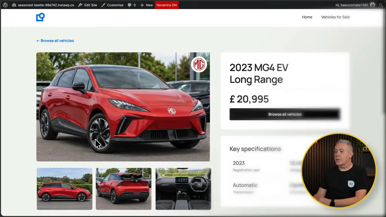
The important distinction is that the content lives in the CMS records. The layouts display that information dynamically, rather than requiring each vehicle’s details to be entered directly into the design.
To add content to an existing collection, open the collection and choose to add a new item. Fill in the relevant fields, then save it as a draft or publish it.
Create a new collection
Creating the structure itself starts from the database icon in the Kirki dashboard. That opens the CMS collections area.
- Click the plus button at the top of the collections panel.
- Choose New Collection.
- Select a preset or create a collection from scratch.
- Give the collection a name and URL.
- Add the custom fields it needs, then create the collection.
There are presets for content such as team members, portfolios and projects. For a custom example, I created a Salesperson collection.
Every collection starts with name and slug fields. From there, you add the fields that suit your content.
Configure custom fields and validation
A rich text field is one option. You can rename it, add help text, set a character limit and mark it as required. Those settings let you define both the information you want and the guidance available to the person entering it.
An image field has media-specific controls. In the salesperson example, I added a profile image field and restricted the accepted formats to JPEG and PNG. You can also apply a file size limit and make the image required.
Carry on adding fields until the collection has the structure you need. Once created, it’s ready for new records, and you can return to its custom fields to make further changes.
Connect collections with references
The field options include Reference and Multi-reference, which let you connect content across collections. This is how the vehicle records connect to models and vehicle types.
For example, suppose a salesperson needs to be linked to a department. You would add a reference field, name it Department and choose the collection it should reference.
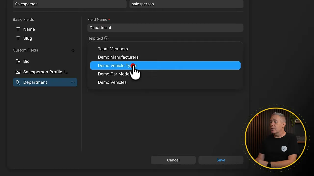
In my demonstration, there wasn’t a department collection, so I temporarily pointed that field at the existing vehicles collection to show the mechanism. The result is a Department field whose choices come from the vehicle records. For an actual department relationship, you would select the relevant department collection instead.
The field label and the referenced collection are separate settings. Naming a field Department doesn’t determine where its choices come from. The collection you select does that.
Display CMS content in a template
Once the data is in place, connecting it to a design is straightforward. The process will be familiar if you’ve used dynamic content in another WordPress builder.
- Open the relevant template or page.
- Select the element that should display the CMS content.
- Click the database icon at the top of the right-hand settings panel.
- Choose the field you want to display.
For the vehicle cards, I selected the text element used for the vehicle name and connected it to the collection’s Name field. The generic text was then replaced with the corresponding vehicle names.
You’re still building and styling the layout visually. The difference is that its content comes from Kirki’s CMS collections rather than being typed into each element.
2. Import Figma Designs into Kirki
If you prefer to work through your designs in Figma first, Kirki has a plugin for transferring those designs into the builder. You can bring across an individual section or an entire design.
There is some preparation involved, though. This isn’t simply a case of creating any arrangement of layers and assuming it will behave responsively after import.
Prepare the Figma design
Install the Figma to Kirki plugin inside Figma, then check the plugin guidance for its naming conventions and supported design setup.
One of the key requirements is using Auto Layout. This provides the layout structure needed to help the imported design adapt at different breakpoints. If that part of Figma is unfamiliar, the Figma Auto Layout guide provides useful background.
Follow the plugin’s preparation guidelines before generating the content. The import process depends on how the original design is structured.
Generate, copy and paste
For this example, I used a photography portfolio design with several sections and imported just the Selected Works image grid.
- Select the complete section in Figma.
- Open Figma’s tools and find the Figma to Kirki plugin.
- Run the plugin.
- Click Generate and Copy.
- Wait for the plugin to generate a preview of the selected content.
- Switch to Kirki and select the destination page.
- Paste with Ctrl + V on Windows or Command + V on Mac.
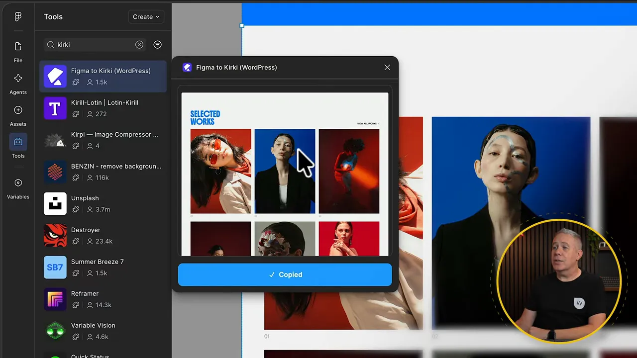
After pasting, the selected section appears in the Kirki editor. Expanding it in the layers panel exposes the imported structure, and you can rename the elements if needed.
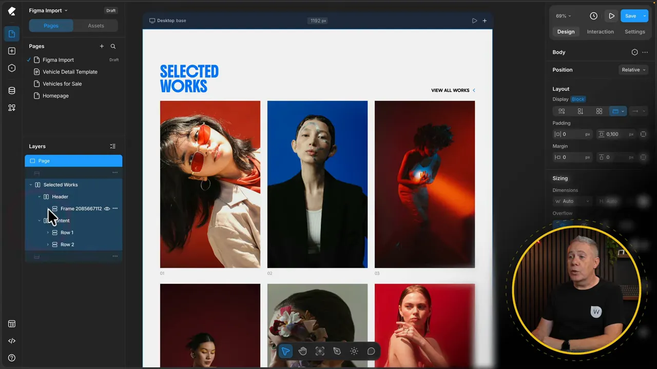
The same process can be used for a complete design. I used a single section here to keep the example focused on the transfer itself.
3. Animations and Interactions: Presets or a Custom Timeline
Kirki’s animation controls sit under the Interactions tab. There are two main approaches demonstrated here: use the animation library for preset effects, or choose triggers and build an interaction in the timeline editor.
Animate a group with Children Reveal
The hero section contains several text elements and a button. Rather than assigning an animation to each one separately, select their parent container and apply Children Reveal.
- Select the parent container, in this case Hero Copy.
- Open the Interactions tab.
- Under Library, click Browse.
- Choose Children Reveal.
- Select a preset and adjust its settings.
I used the Soft Bloom preset. Depending on the preset, the available controls include opacity, scale and blur. Switching to Fade In or Zoom In changes the controls to suit that effect.
You can target all the child elements or make a custom selection. For custom targeting, hold Shift, select the elements on the page and add them to the selection.
There are also animation curve controls. Choose an easing option, such as ease in and ease out, or open the curve editor to adjust easing and spring parameters. The preview gives you a way to check the movement before confirming the settings.
Once applied, the parent container’s child elements animate using that reveal setup.
Animate an individual image with Self Reveal
For a single element, use Self Reveal instead. I applied this to the hero image, again using Soft Bloom, with a delay of roughly 300 milliseconds and a duration of 400 milliseconds.
That creates a slight delay between the text reveal and the image animation. The group and image can therefore have their own timing without manually building every effect in the timeline.
Build a custom hover effect in the timeline
For a custom interaction, start with a trigger. A simple button background change is enough to demonstrate the process.
The goal here is to turn the Browse Vehicles button blue when the pointer enters it, then return it to black when the pointer leaves.
- Select the Browse Vehicles button.
- In Interactions, add a Hover In trigger.
- When the timeline opens, click the plus beside the button in the layers panel to add it as a target.
- Click in the timeline and choose Background Color.
- Select the animation block to open its settings.
- Choose the destination color. In this example, I used an existing color variable.
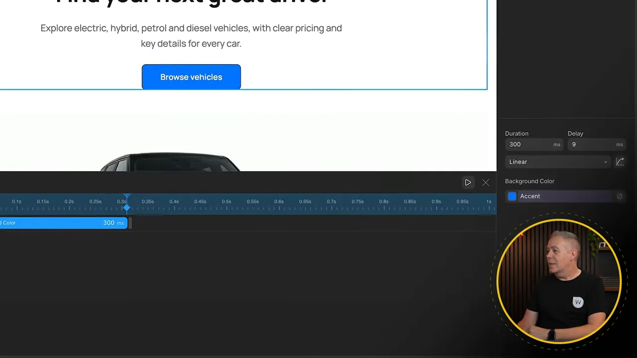
That defines the entry state. To reverse it, add a separate Hover Out trigger, target the same button and add another background color animation. Set its destination to the original black.
Previewing the page confirms both parts: the button changes to blue on hover and returns to black when the pointer moves away.
Remember to define the return interaction as well as the entry interaction. In this setup, Hover In and Hover Out are configured separately.
The timeline goes beyond this simple color change. You can add more targets and effects, move animation blocks to offset their start times, and change their durations. That gives you control over effects that run together or appear in a staggered sequence.
4. Infinite Canvas for Responsive Design
Most page builders show one responsive layout at a time. You work in desktop mode, switch to a tablet breakpoint, then switch again to mobile.
Kirki’s Infinite Canvas gives you another way to work: zoom out and see multiple breakpoint layouts alongside one another in the same workspace.
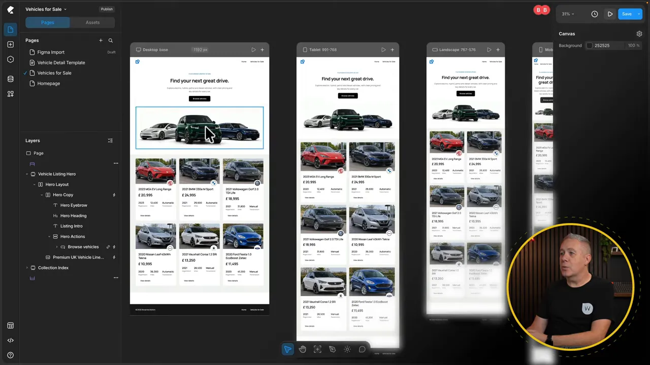
As you make changes, you can see how they flow down through the different breakpoints without continually switching between separate views.
Add a custom breakpoint
You aren’t restricted to the standard breakpoint set. To add another:
- Go to the desktop preview’s header.
- Click the plus button.
- Create a custom breakpoint.
- Give it a name and width.
- Click Done.
In this example, I created an Extra Large breakpoint at 1,400 pixels. That breakpoint covers widths of 1,400 pixels and above, and its preview was displayed at 1,600 pixels. The preview width can be changed independently to inspect another size within that range.
With the extra breakpoint added, the workspace contained five breakpoint previews to work across.
Check layouts in isolation and between breakpoints
The canvas doesn’t replace the more traditional preview. Each layout has a play button that opens it in isolation.
From there, drag the preview edges to resize it and check how the layout responds in real time. This is particularly useful when checking fluid typography and scaling, because you can inspect widths between the defined breakpoints rather than checking only the preset sizes.
You can also switch directly between the breakpoint options in that preview. Use the canvas for the wider comparison, then move into an individual preview when you need to inspect or interact with a layout more closely.
Four Features, Four Parts of the Workflow
These four features cover distinct jobs. CMS collections define and connect the content. The Figma plugin transfers prepared designs into the editor. Interactions provide preset animations and custom timeline control. Infinite Canvas puts responsive layouts together in one workspace.
The vehicle example shows how those pieces fit into a practical build, from structured records and dynamic templates through to animation and responsive checks. Whether that approach suits your own projects depends on how you prefer to manage content, prepare designs and work across screen sizes.


